
‘‘Use a picture. It’s worth a thousand words.’’ Tess Flanders, 1911
Introduction
The use of infographics and data visualisations is booming in journalism. Journalistic excellence in this field is officially recognised in the form of new professional awards such as The Data Journalism Awards (established in 2012 by The Global Editors’ Network), and in new categories such as ‘Digital innovation’ in the Amnesty International Media Awards and ‘The Digital Award’ within The British Press Awards.
According to Oxford Dictionary, a data visualisation presents information using chart, diagram, pictures and graphics.
Now more than ever, data are collected from every aspect of our lives, ‘‘consumers going about their day—communicating, browsing, buying, sharing, searching—create their own enormous trails of data” (McKinsey, Global Institute Report on Big Data, 2011, p.1). Not only this trend is a reason for journalists to focus more on visuals and visualisations, but the increasing fierce competition among media and the growing focus on images among the audience is leading news organisations to look into the potentials of visual storytelling. In a digitised world invaded by fake news, editors are also betting that data visualisation will help rebuilding public trust in the media.
The growing status of interactive graphics on our news and on the news profession more widely is evident, within and beyond journalism practice. Many media including The Guardian, the NYT and the BBC, have interactive teams or ‘Visual Journalism unit’ working on how to communicate data to readers and to the audience in an effective, meaningful way.
While data and journalism have always been together, the skill of working with and interpreting data in visuals, is challenging both journalists and designers and gives them new responsibilities that lie in ethical concerns. A survey conducted by the European Journalism Centre reveals that 70% of the journalists believe data journalism is very important, but at the same time, even more respondents feel they lacked adequate knowledge (Bradshaw, 2011).
How is data visualisation changing our understanding of the world? This essay investigates the political and social implications of using data visualisation to tell stories and argues that more than just a simple picture, visualisation helps humans explore and understand an overwhelming and complex volume of information, and to communicate that understanding to others.
Helping comprehension
Telling complex stories
Visualisation is becoming the “next mass communication medium” and is emerging as a critical tool for helping readers navigate the abundance of information (Viegas and Wattenberg, 2011). Several studies stress that visualisations allow newspapers to optimise the understanding processes, thanks to compressed quantity of information and a greater precision, anchored in image and text. They provide multiple ways of conveying and labelling stories driven by facts. Data visualisation intends to clarify and integrate complex information quickly, clearly and intelligently.
According to Card et al. (1999), data visualisation covers the properties of visual perception, to resolve logical problems. It investigates how a visual display of information can serve as a new method, for amplifying cognition and generate new knowledge and insight about the world. ‘‘Visual storytelling, […] might be of critical importance in providing intuitive and fast exploration of very large data resources.” (Wojtkowski and Wojtkowski, 2002, p.33).
Keen coverage of complicated issues is part of journalists’ responsibility, thus, using data visualisation is a precious tool for newsrooms to generate ground breaking ways to understand society’s most difficult problems and lead public to badly needed solutions.
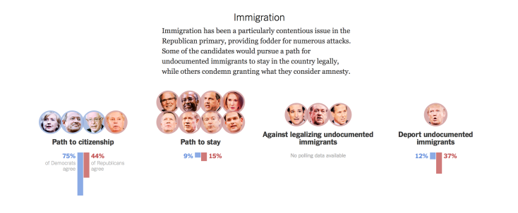
Where information is less exciting to the public, visualisations are invaluable. Taking the example of the 2016’s presidential election in the USA, The New York Times has managed to turn data about candidates’ stances on complex social and political issues that are difficult to package – like immigration, climate change and gun control – into compelling news narratives with a data visualisation.
Empowering the public
The BBC defines “data journalism” as a way to enable a reader to discover information that is personally relevant and to reveal a story that is remarkable and previously unknown.
Indeed, well-designed and interactive visualisations allow users to intuitively play with the story, to drill deeper into charts and graphs for more detail. It enhances an audience’s ability to extract answers and make meaning from the information gathered. Consequently, the public can grasp difficult concepts easily and make informed decisions – such as who’ll get their vote on election’s day. Potential political implication emerges.
Mike Scaife (1996) adds that visualisation is a mechanism by which humans perceive, interpret, use and communicate information. It focuses more on design to allow users to explore datasets for their own purposes. In the Data Journalism Handbook (2012), a journalist from the FT emphasises the importance of visualisations that allow the user to explore something that affects them directly, or that encourage the exploration of complicated major topics.
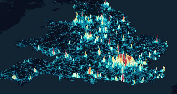
‘‘If it doesn’t engage you, if you don’t get instant satisfaction, then you will never get to the second layer: ‘what is this showing?’ confirms a journalist working at the NYT, (Dick, 2013, p.11). Visualisation is a powerful tool to engage people into stories and beyond, to make them involve into complex social issues. The Guardian, for example, collated an interactive map about police killings in the USA, that allows a deeper and visually engaging look at what’s become a huge societal problem.
Retain and recall information
What are the decisive factors that make news visualisations ‘work’ for the public? Segel and Heer (2010) divide data visualisation’s tactics into three sections: (i) ordering, (ii) interactivity, and (iii) messaging. These strategies increase content’s redundancy and make viewers more likely to remember both the data and the larger message.
According to a MIT-Harvard University study, pictures and graphics give readers additional associations that help them retain and recall the content. Simple visuals such as pictograms are especially efficient helping the public understand elementary causes and consequences and have an important role in disseminating knowledge. A good visualisation should embrace the complexity of information, while presenting it in a comprehensible and meaningful form.
The BBC found out that a portion of the general public are intimidated by charts of all kinds, because they remind them of unhappy memories of studying mathematics at school. Equally, some audiences find circles more visually appealing.
Card et al. conclude that data visualisation can help in six ways: increasing the memory and processing resources available to users; reducing the search for information; using visual representations to enhance the detection of patterns; enabling perceptual inference operations; using perceptual attention mechanisms for monitoring; and encoding information in a medium that can be manipulated.
Data visualisation, changing the value of news
The automated journalist
Data visualisation is improving the quality of journalism. From the research phase, visualisations can help journalists identify themes and questions for the rest of their reporting; to the publishing phase, where visualisations can illustrate a point made in a story in a more compelling way and allow exploration, as we have investigated previously.
However, these improvements raise question to what extent are journalism’s cultural authority and technological practices, changing in the context of big data and visualisation? And how might such changes be connected with news audiences, story forms, organisational arrangements, and news values and ethics?
Sylvain Parasie critics “how journalists rely on the material environment of their organization to decide whether their knowledge claims are justified or not.” These material factors include databases and algorithms, which “are not black boxes providing unquestionable results, and [thus] we need to examine the material basis on which they collectively hold a specific output as being justified” (2014, p.365)
Matt Carlson calls “the role of big data in journalism shifts from a reporting tool to the generation of news content” (2014, p.419), automated journalism. According to him, “questions need to be asked regarding whether an increase in algorithmic judgment will lead to a decline in the authority of human judgment” (2014, p.429).
Ultimately, the developments of data and visualisation, Lewis and Westlund augur, have ‘‘potentially big changes for journalism: from shifting articulations of knowledge (epistemology) to highly technical skill sets and analytical understandings (expertise) to vexing questions of value creation, monetization, and media innovation (economics),’’ (2014b, p.459) and values (ethics).
As quantitative journalism becomes more central to journalism’s professional core, and as computational and algorithmic techniques likewise become intertwined with the economic models on which journalism is supported, critical questions will steadily emerge about the socio-material relationship of big data, journalism and the audience.
Open data, open news: the need for transparency
Data visualisation is improving transparency about reporting processes. Meyer (2004) found that interactive infographics could help newspapers add value and enhance the quality of their informational product and therefore have a pivotal function on the influence and credibility of a newspaper company. This is an invaluable asset in the era of fake news and when mistrust towards the media has never been higher.
However, the condition to increase transparency, involve that the media should have embedded data onto their site, in a visualisation and in a form that allows public for easy download of the dataset. Readers must be able to explore the data behind the stories through interacting in the visualisation or using the data themselves in other ways.
‘‘Journalists have a very important role in bringing this inherent humanity of data to light. By doing so, they have the power to change public understanding — both of data and of the systems from which the numbers emerged’’ explains Jer Thorp, Data Artist for the NYT (Data Journalism Handbook, 2012, p.181).
An open process for data-driven journalism is needed and every visualisation must be published with access to both the data behind it and the code that powers it. ‘‘Enabling your readers to check your work, find your mistakes, and pick out things that you might have missed will make both your journalism — and the experience for your reader —infinitely better’’ claims Duncan Geere for Wired.co.uk (Data Journalism Handbook, 2012, p.220).
Finally, journalists should bear in mind that data is often messy and needs to be cleaned and that they may have undocumented features.
Making data visualisation, the problematic outcomes
Selective processes and objectivity in question
To what extent does data visualisation influence how journalists tell stories and thus, produce specific knowledge for the public? How are news visualisation ideas selected and treated?
‘‘Visual rhetoric refers to the intended meanings that are represented in the visualisation via a designer’s choices and then shaped by individual end-user characteristics, contextual factors involving societal or cultural codes, and the end-user’s interaction’’ (Ng, 2014, p.3). With data visualisation, newsrooms have the power to change or reinforce the audience’s beliefs and to make arguments more persuasive. Cultural knowledge in this process, provides the basis for interaction and seduction (Scott, 1990).
It is essential to keep in mind that people create data, “they are hybrid, composed of both human intentionality and material obduracy” (Anderson, 2013, p.1016). Consequently, data couldn’t be a hundred per cent objective; it can be interpreted in many different ways and potentially biased. As such, we need to put visualisation into perspective and context (Lewis and Westlund 2014a). Data visualisation might be considered as an ‘assemblage’ of material, cultural, and journalistic skills elements.
In addition, the production of information visualisation often involves bringing professionals from statistical, information design, and computing backgrounds into the newsroom. These professionals might bring voluntarily or not, influences that in turn, affect how interactive stories are selected, treated and published. According to Bakker et al. (2012), there are three crucial aspects that influence the production process of data visualisation: skills, mindset and management.
The sourcing of data is also problematic and can lead to ethical issues, as a journalist from the BBC explains: ‘‘he received a large amount of proprietary data from an organisation who in return wanted publicity around the issue of music piracy. […] He said they had to make difficult decisions about this, and be careful not to use the data in a way that may work to the commercial advantage of the source who provided the data. He sees journalists as ‘customers’. He explains that there is some editorial over-lap between project managers and data journalists; suggesting the rise in tensions caused by the increasing fusion of form and content in online journalism,’’(Dick, 2013, p.7).
The risk of the aestheticisation of news
How design techniques prioritise particular interpretations in visualisation storytelling and their influence on end-user interpretation? ‘‘It doesn’t matter, it might be worthless – but if it is beautiful you will look at it, and realise it’s worthless,’’ says a journalist working at the NYT (Dick, 2013, p.11). This statement sheds light on the importance of presenting data in a visually appealing way, but also stresses the lack of interesting news values in some data visualisation.
Ann C. Tyler (1992) summarises the three purposes of design to persuade the audience to act, to educate it and to provide it with an experience. Critical questions emerge about who does it, how, why and the aftermath of persuading a targeted audience to adopt a new belief or behaviour. The visual rhetoric pertains to the visual elements of the document and affects the reader’s initial impression of the document (Brumberger, 2001). It can also affect the tone and credibility of a document, add Kostelnick and Roberts (1998).
The pursuit of certain popular data visualisation formats, and the active avoidance of others, for fear of alienating news audiences, may yet have consequences for how journalists interact with the public and how the public understand online news.
Visualisation is reporting and Meyer (2002) argues that journalists should take a scientific approach to analysing data, preferably using social science research methods in order to prevent ethical issues and biases.
Prettiness is a bonus; if it obliterates the ability to read the story of the visualisation, or if it is just privileging style over substance, it’s not worth adding some wild data visualisation or strange interface.
Conclusion
Storytelling today is increasingly accompanied by informational graphics and data visualisations, and these are becoming more sophisticated than ever.
Visualisation can be strikingly beautiful and attention getting, it considerably helps to foster conversations and audience engagement. Most of all, it leverages a powerful cognitive advantage: fully half of the human brain is devoted to processing visual information. Even after you’ve stopped looking it, a good data visualisation gets into your head and leaves a lasting mental model of a fact, trend, or process. Data visualisations grant huge rewards for both the media and society regarding enhancement of perception, persuasion, interpretation and understanding of news stories.
However, data visualisation is also deeply rooted in measurable facts and lies in quantitative data sets and algorithms that are not unquestionable. Visualisation has limits and risks for journalists. News value shouldn’t be neglected for prettiness. The selection and treatment of information into visual storytelling must be meticulously thought, bearing in mind that journalists are dealing with ethical concerns and potential biases that might dangerously influence and change the audience beliefs and behaviours.
In the battle for the future of data-driven journalism, visualisations are crucial. After years of disruption, will the media make the best of the tools they have created, or will data sets and algorithms add about devaluation in the profession of journalism and a collapse of trust in media organisations?
“Big data will not change the world unless it’s collected and synthesized into tools that have a public benefit,” says Sarah Williams, an assistant professor of urban planning at MIT.
Jade Lévin
